Decorating Made Easy
If you are looking for the best Benjamin Moore paint colors, this post is for you! I have been “playing” in paint for over 20 years. Over those 20 years, I have learned so much about paint, and today I hope to help you save time and money!
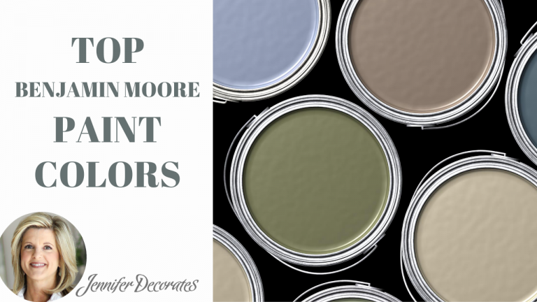
Before we dive into my top favorite colors, I would like to share a few painting tips that will save a TON of frustration, and make your DIY project go much more smoothly!
Learn about two paint terminologies. HUE – this is simply the color of the paint. VALUE – this is the lightness or darkness of the color.
Compare several different paint colors in similar hues up against one another. You will begin to see how one color may pull more blue, or another may pull more green.

White Paper Test – What in the world am I talking about? Well, take a sample of paint color that you would like to see how dark or light it may be on your wall, and hold it up against a white piece of paper! Then you will see what the value of that color is going to be.
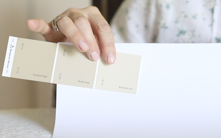
I wish I would have come up with this idea! So, there is a company (I am not an affiliate) called Samplize.com. You simply enter the paint color you are interested in and they mail you a 12 x 12 paint sample with an adhesive back so you place right on your wall to see how it looks! REMEMBER, look at your paint sample in the daytime and the nighttime.
Choosing the right sheen. I work with a lot of clients who are building new homes. MOST builders will paint an entire house in FLAT paint. In my opinion, flat paint only belongs on the ceiling.
I like to use eggshell in the living areas and satin in the kitchen and bathrooms.
Okay, time to chat about paint colors. Now, instead of me giving you popular Benjamin Moore paint colors, I want to share with you colors that I consider to be very timeless.
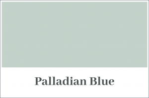
I was introduced to this color from Cole @coleworlld. She used it on her porch ceiling. It is a haint blue. I was told it was first used to ward off spirits, but now we use it to ward off birds!
These two blues are soft and serene! They would look great in a bedroom, bathroom, or laundry room!


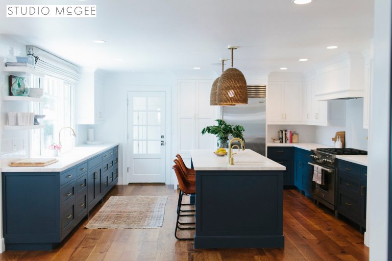
This gorgeous kitchen below was designed by STUDIO MCGEE. Have you heard of them? I bet you have! Their design style is impeccable! They used Hale Navy on the kitchen cabinets and the kitchen island. STUNNING!
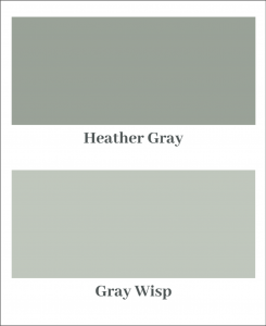
Both of these greens have a hint of gray in them. Colors that are a little muted, create warm and timeless feel in a room.
Many times when you try to go light with a paint color that isn’t a little muted, the color can become very pastel. And, then it looks like that color should belong in a nursery.
I want to share my favorite beige colors. These three colors are very timeless as well.

This color is probably my all time favorite color! It is a beige/gray and goes so well with black home decor or brown home decor!

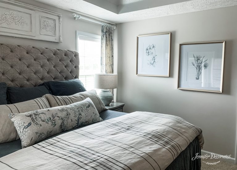
I love Pale Oak! It is a soft and comforting color! Below is a photo of my bedroom painted in this color.
If you are looking for a beige that isn’t too yellow, and does not have any gray in it – Manchester Tan is it!

These three whites are some of my top favorites.
Chantilly Lace is the lightest white, and has a hint of gray.
Simply White is a warmer white, with a hint of cream or beige.
Dove Wing is the darkest of these three colors, and would look great with darker paint colors.
Just make sure that your trim color is a contrast with your wall color and both compliment each other. Also, take the white paint sample you like best and make sure it looks good with your flooring, and with the countertops and cabinets in your bathrooms and kitchen.
When it comes to choosing a black paint color, again I lean towards a muted black. Here are my two favorite Benjamin Moore black paint colors:
Wrought Iron is such a beautiful and warm black. It is a great color to use on exterior and interior doors, trim, and exterior shutters.
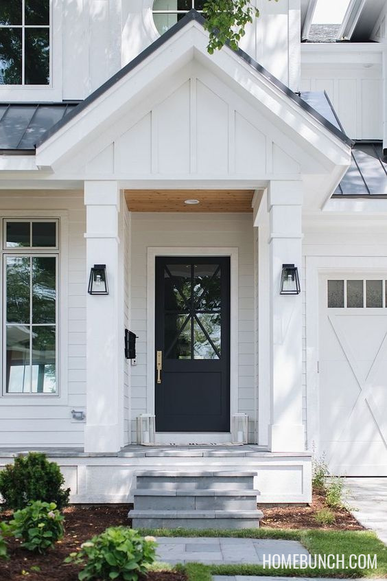
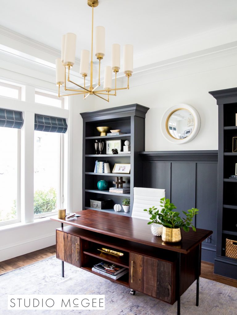
I think whoever gets to name nail polish and paint colors, has a super FUN job! Cheating Heart is still a muted black, but a bit darker. Again, Studio McGee hit it out of the park with the color.
My client also choose this color for her hall tree in her second entryway. She used brass hooks on her wall tree, and the contrast was very inviting.
Well, I hope sharing with you some of what I consider the best Benjamin Moore paint colors will help you in any of your DIY projects. If you would like to watch my video about choosing paint colors, just click below. Thank you.

“Flexoffers”
I believe the master bedroom should be our refuge and the place to finally take a deep breath after a long day. When decorating the master bedroom, I always start with the bedding before choosing the drapes and then pull the rest of the design together. After all, the master bed is the focal part of the room and choosing the right bedding can be daunting! One of the things I find most rewarding is helping clients find beautiful bedding ideas!
If there is one room you really need to make your priority, it is this room! I am so excited to share with you some of my favorite beautiful bedding ideas!
It is no secret to our clients that the Micah Bedding is our absolute favorite bedding! Micah is a gorgeous bedding collection with an elegant, classy look. Used regularly in our design work, we adore how easy this bedding can transform a master suite!
The Micah is a bedspread that comes with a thin padded top and a long, ruffled skirt that hangs to the floor. That means- no bedskirt needed! I cannot stop raving about how gorgeous this bedding ensemble is!
The Micah collection is also available in Steel Blue. I actually have it in my own master bedroom here– I absolutely love it!
The second part of my favorite bedding is layering! The Brooks Bedding ensemble is the perfect bedding to layer with. The natural linen with the charcoal colored stripes are such a classic pattern that you can truly make work in any space!
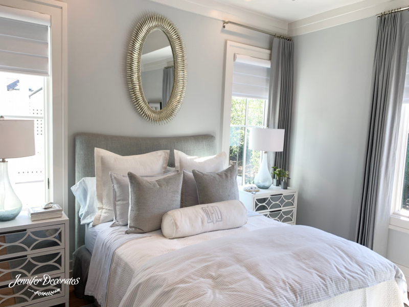
When you have a gray bedroom, white bedding is a great choice! After choosing the white bedding, I like to add a little gray color in the pillows. Next, choosing gray drapes that are darker than the gray walls is an excellent complementary contrast.
Lastly, having the front pillow monogrammed is a great way to add a personal touch!
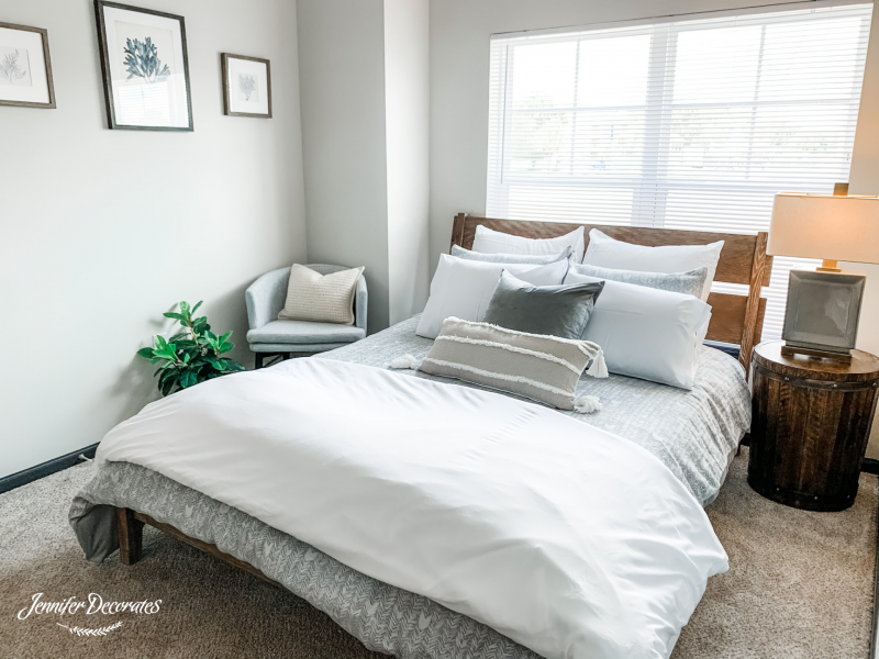
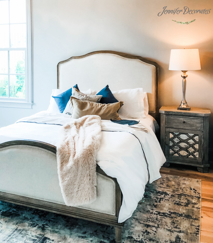
One of my favorite beautiful bedding ideas is white bedding! White bedding keeps the room soft and serene. The blue pillows add a beautiful pop of color and drama to the white bedding.
Next, is another example of white bedding decorating ideas! This is a guest bedroom I decorated for a client. All of the textiles in this room are neutral once again, except for the front pillow. The pop of blue makes the entire bed stand out! Above the bed I added two of my favorite prints that we sell in our online store!
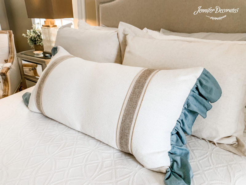
Another beautiful bedding idea is to add one long lumbar pillow in front of the bed! This is a different and beautiful way to style a bed!
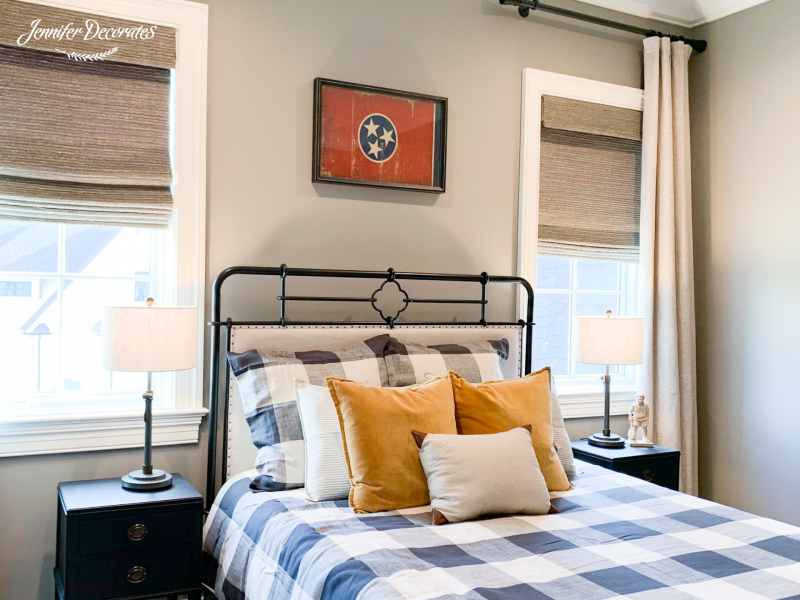
When it comes to masculine bedding ideas, I like to think outside the box! Here in this bedding ensemble, the navy blue and mustard colors look stunning on a black iron bed.
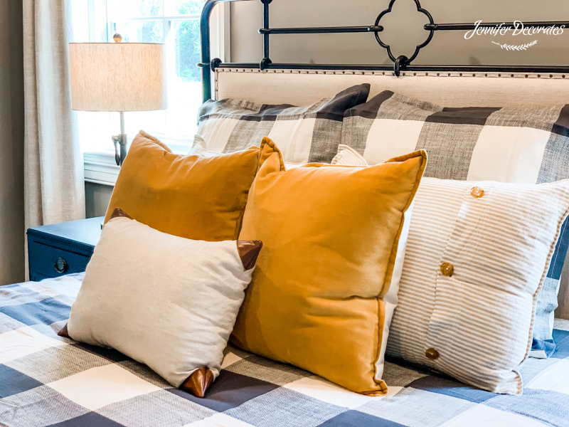
This collection of pillows creates a masculine bed that is still very inviting.
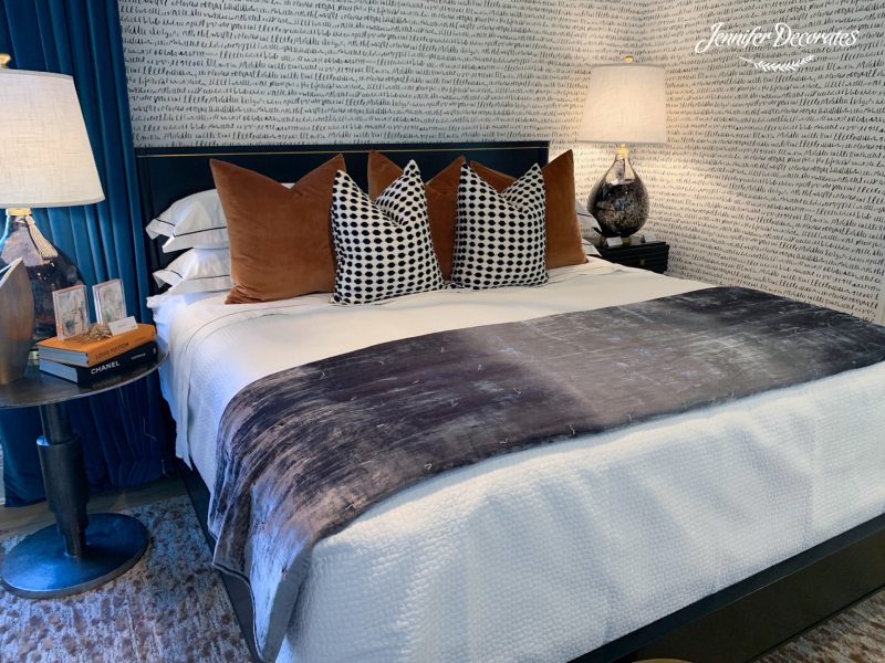
Here is a beautiful masculine bed that I saw in The Parade of Homes at The Grove in Arrington. Don’t you love the wallpaper?! Again, the pillows chosen for the bed are the highlight of the entire bed! If you look closely, you can see they even found a book for the night stand that is almost the same color as the accent pillows- brilliant!
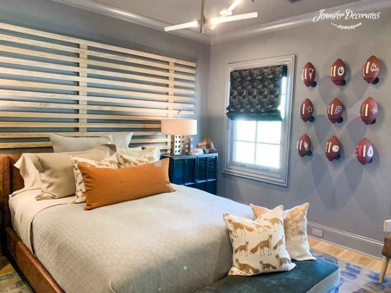
If you are looking for teen bedroom ideas, how about incorporating a sports theme? But, you don’t have to decorate the bed with sports-related bedding. Keep the bedding timeless while pulling color into the design that is cohesive with the rest of your bedroom design.
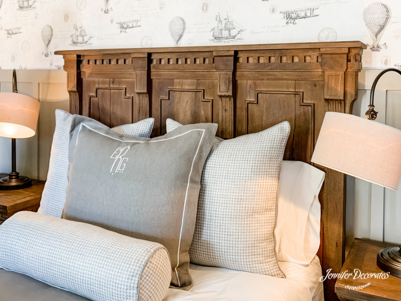
I love the timeless look of this beautiful bedding idea! The bedding is classy and elegant while the wallpaper brings in so much character to the space!
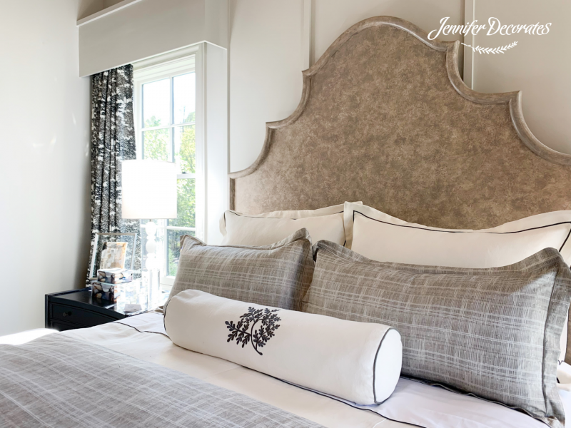
This next room is one of my absolute favorites! I love the beautiful lumbar pillow in the front. Take a peek at the at those wood cornice boards- just stunning!
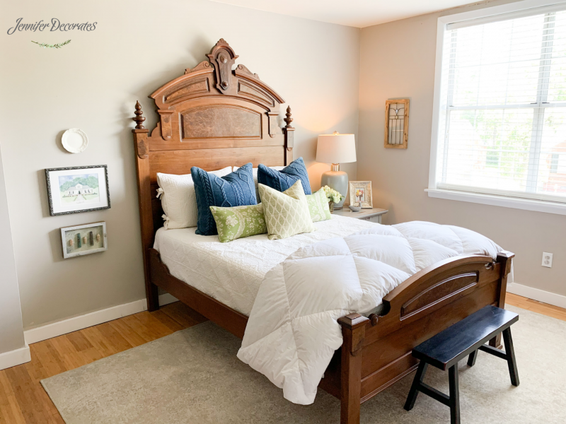
My last Beautiful Bedding Idea is from my design assistant’s home, @ColeWorlld. She is so talented and her entire home is just oozing with design inspiration! If you’d like to see more of her beautiful home, check out the Cozy Home Tour she took me on!
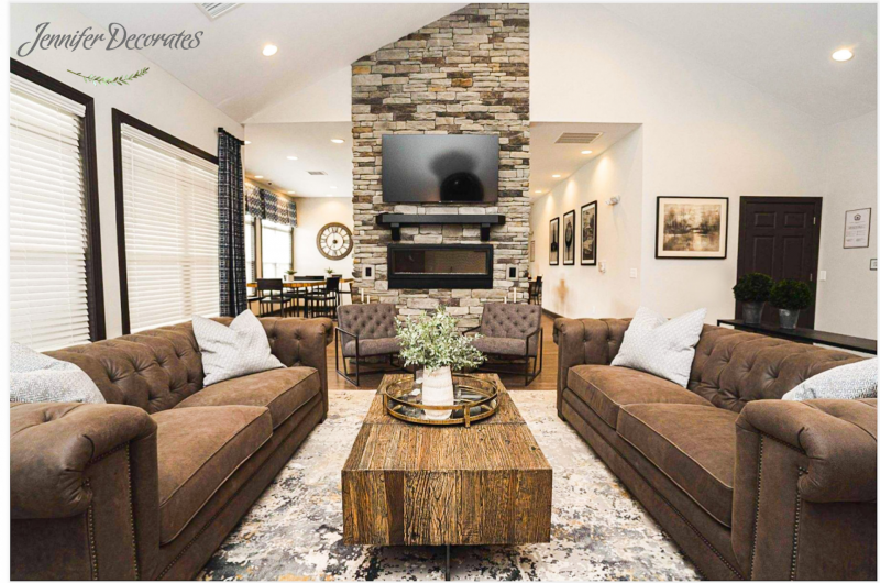
Well, this “Decorating Day”, was an all hands on deck! We had a total of nine team members working 8 hours on a very hot day! The JDs’ team was at the Anthem Creekside Apartments in Smyrna, Tennessee. We decorated an apartment clubhouse, which included a living room design, kitchen area, conference room, and two offices! The style was a mix of modern and industrial design. Making sure to have a sleek feel but not cold, was the key! I am so excited to share with you How to Decorate Industrial Style!
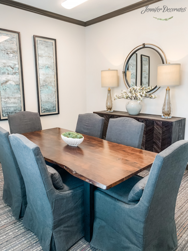
The first room I want to share with you is The Conference Room. I chose a live edge table that we put six chairs around. These chairs are rolling, performance fabric, and extremely comfortable!
In addition, I added a buffet that I absolutely love! It has a wood top with rounded metal drawer pulls that really give it a modern look.
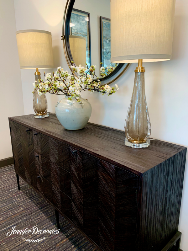
Next, I added these two beautiful lamps. You can click here and find them in my online store! They’ve got a little bit of gold and a little bit of bling which was the perfect modern touch!
Lastly, I added the floral in the middle. The Vintage Stoneware Vase is one of my all time favorites! Adding industrial style decorative accessories can be so difficult! This vase was the perfect addition and the floral softened the room beautifully.

After the Conference room was the Common Room of the clubhouse! This room is huge and the ceilings are vaulted. We had a very large wall that needed a very large piece of furniture.
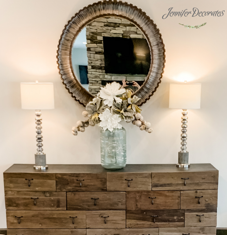
This buffet fit the bill and is absolutely stunning! It was the perfect addition to the large space.
I added two very modern looking buffet lamps, you can find those here. In the middle I added a large floral and added my own foam flowers. When navigating how to decorate industrial style, foam flowers are a modern way to add florals to your design!
If you are interested in a video on how I made an arrangement with foam flowers, you can check it out here! The flowers are packaged together and available for purchase in our online store.
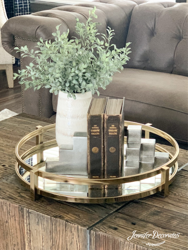
On top of the coffee table I kept it pretty simple with a round brass mirrored tray. Then, on top I put these two bookends and added some greenery. I love using our Sandrine Bookends in my designs. They add elegance to any space- just stunning!
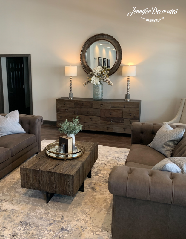
This rug is absolutely beautiful. It has a little bit of blues and grays and pulled everything together perfectly! This rug pulled together all the colors in the room, and grounded the entire design. You can also find this rug in our online store!
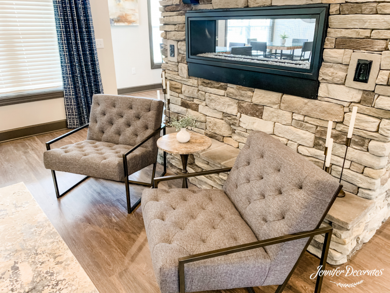
Finally, we added these two Industrial Style Cafe chairs in front of the fireplace. This made for a very large area for a lot of people to congregate.
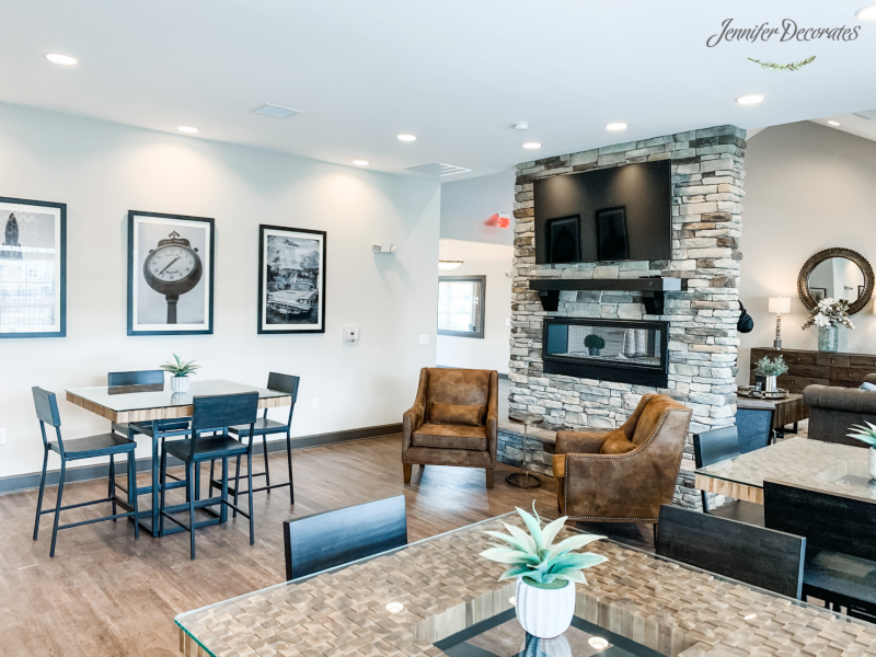
Last but not least, we are in the party room! I chose three tables that will be low maintenance as this room will have a LOT of traffic!
On the large wall, you can see three large photographs. They were actually done by my daughter, Sarah. She went around Smyrna, Tennessee and took gorgeous landmark photos! If you are looking for a videographer or photographer check out her work on her Instagram page at Sarah Davenport Photography. She does amazing work, if I do say so myself.
I absolutely loved doing this Industrial Style Apartment Clubhouse! If you would like to see more on How to Decorate Industrial Style, simply click the link below. If you’d like to see more tours and makeovers- check out my other posts here!
Thank you and have a wonderful day!
-Jennifer